

A friend showed up to dinner last year wearing what looked like a perfectly tailored blazer, slim trousers, and clean white sneakers. The whole table assumed she’d finally splurged on something designer.
She hadn’t. The blazer was from Zara. Those trousers came from a thrift store in her neighborhood. Her sneakers were Common Projects lookalikes she’d found on sale for thirty dollars.
Nobody believed her when she told us. That moment made me genuinely curious about what she was doing differently. Because I’d spent considerably more on clothes that somehow never looked half as polished.
What followed was about two years of paying close attention. Observing what stylish people actually wore. Reading about fit, color theory, and fabric behavior. Making a lot of expensive mistakes and a few cheap wins. This article is the distilled version of what I learned.
The Real Reason Clothes Look Cheap or Expensive
Most people assume price creates the perception of quality. Sometimes that’s true. Often it isn’t.
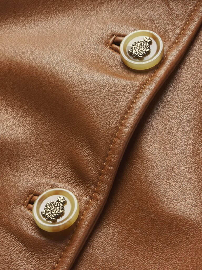
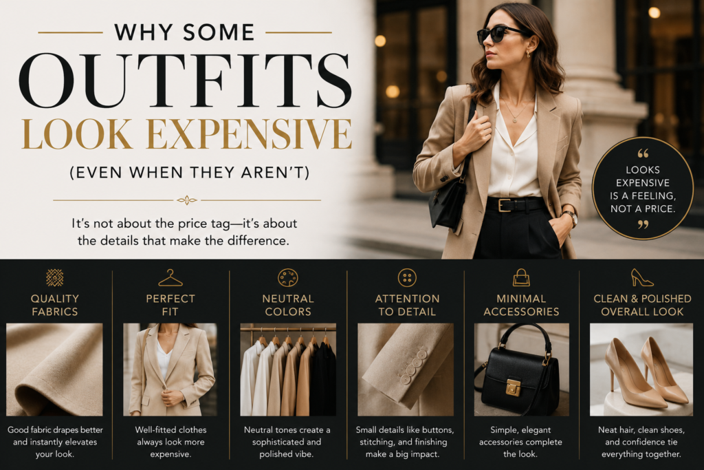
What actually signals expense to the human eye has very little to do with a price tag. It has everything to do with fit, proportion, color coordination, fabric behavior, and the absence of visual clutter. A five hundred dollar shirt worn badly looks worse than a thirty dollar one worn well.
The brain reads clothing through shortcuts. Certain visual cues trigger an automatic “expensive” or “cheap” response before any conscious evaluation happens. Understanding those cues is where the real leverage sits.
Fit Is the Single Biggest Factor
Nothing else comes close. Fit is the difference between looking polished and looking like you grabbed something off a random rack in a hurry.
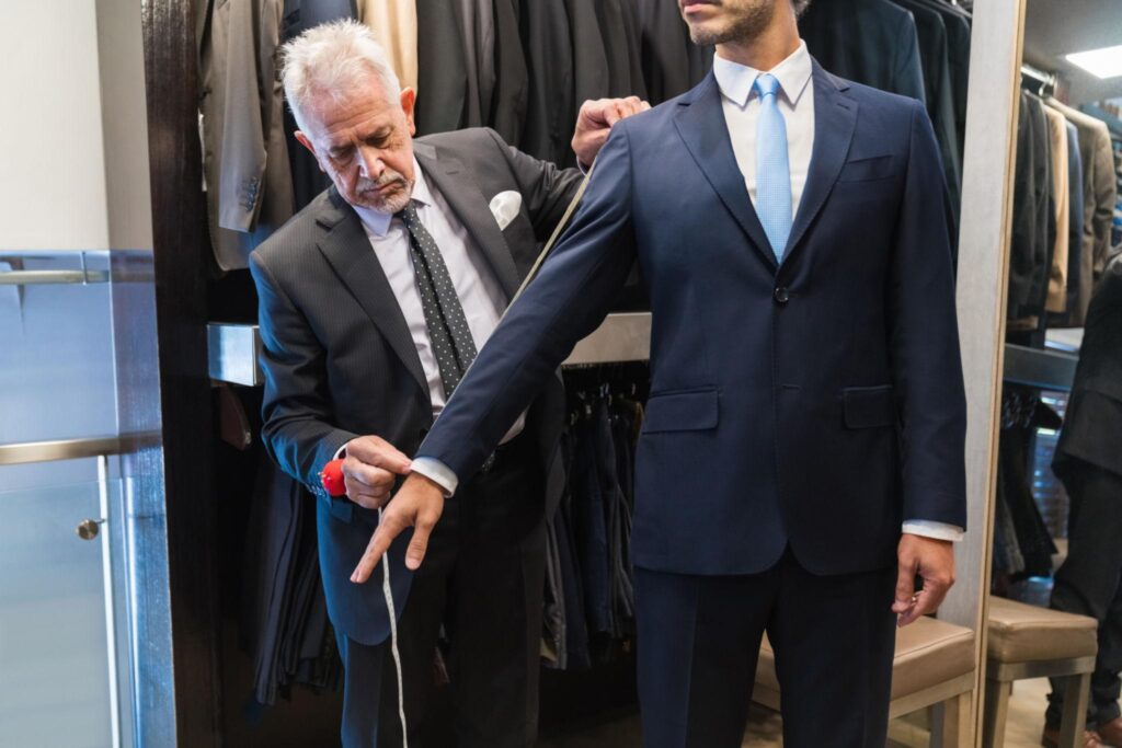
Expensive clothes from luxury brands fit so well partly because they’re cut with more precision. But the actual secret is that wealthy people also tailor their clothes. A two hundred dollar suit that’s been tailored properly looks better than an eight hundred dollar one worn straight off the hanger.
Tailoring sounds intimidating and expensive. It doesn’t have to be. Basic alterations like hemming trousers, taking in a shirt at the waist, or shortening jacket sleeves cost between ten and forty dollars at most local tailors. These small adjustments change how an entire outfit reads.
Where Fit Goes Wrong Most Often
Shoulder seams are the most telling detail on any top or jacket. The seam where the sleeve meets the body should sit exactly at the edge of your shoulder bone. Not hanging off it. Pulling inward is equally wrong. That edge is the only place it should land.
When shoulder seams sit incorrectly, no amount of other styling fixes the silhouette. This is the single fitting mistake I see most often. It also can’t be easily corrected by a tailor once the garment is purchased.
Trouser length matters enormously too. Most men’s trousers come too long by default. A slight break at the shoe is traditional. No break at all looks cleaner and more modern. Pooling fabric at the ankle looks messy regardless of how much the trousers cost.
Sleeve length on shirts and jackets also reads instantly. Shirt sleeves should show about half an inch below a jacket sleeve. Jacket sleeves should end right at your wrist bone. These proportions are small but they register clearly.
Color Does More Work Than Most People Realize
Loud, mismatched colors signal effort in a way that reads as trying too hard. Expensive looking outfits tend to use a restrained color palette.
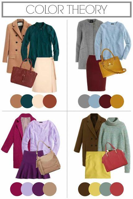
This doesn’t mean boring. It means intentional. Neutral foundations like navy, grey, camel, white, cream, and black form the basis of most quietly expensive looking wardrobes. These colors pair easily with each other and with most shoes and accessories.
The three color rule is a useful starting framework. Limiting any single outfit to three colors or fewer keeps the visual picture clean. One of those three should usually be a neutral. Black trousers, a white shirt, and a camel coat as the third piece is an example that works in almost any context.
Tonal Dressing: The Technique Behind That Effortless Look
Tonal dressing means wearing different shades of the same color family together. All navy with a slightly different navy. Cream top with beige trousers and tan shoes. Light grey with mid grey.
This approach looks inherently elevated. It reads as considered without being flashy. Many of the outfits that stop you on the street or in a magazine are tonal rather than colorful.
The easiest version to start with is an all-white or all-cream outfit for warmer months. All-black for cooler ones. Both read as intentional immediately. Neither requires expensive pieces to pull off.
Fabric Behavior Signals Quality Before Anyone Touches the Garment
Fabric that holds its shape, drapes well, and doesn’t pill after two washes looks expensive even in a photo. Material that wrinkles instantly, clings in unflattering ways, or develops fuzz balls after minimal wear looks cheap regardless of price.
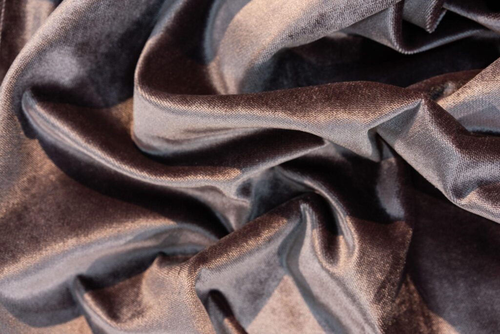
The fabrics that typically behave well include cotton with a higher thread count, wool, linen after it settles, silk, and quality synthetic blends designed for specific purposes like stretch trousers. Cheaper garments tend to use thin jersey, heavily synthetic blends that pill easily, and polyester that wrinkles badly and doesn’t breathe.
Learning to assess fabric by touch and visual drape before purchasing saves a lot of money long term. A garment that photographs beautifully on a model but goes limp and wrinkled the moment you put it on will never look polished in real wear.
The Wrinkle Test Before Buying
Grab a handful of the fabric and squeeze it for five seconds. Release and observe. If the wrinkles fall out within a few moments, the fabric has reasonable recovery. Crisp, stubborn wrinkle lines that stay visible mean the fabric will look exactly like that every time you wear it without ironing.
This simple check works in any store. No experience required. It takes about ten seconds and prevents a lot of purchases that look great on the hanger but disappoint in real life.
The Role of Shoes and How Often People Get This Wrong
Shoes communicate more than most people account for when building an outfit. An otherwise well put together look can read as careless if the shoes are scuffed, poorly maintained, or visually incompatible with the rest of the clothing.
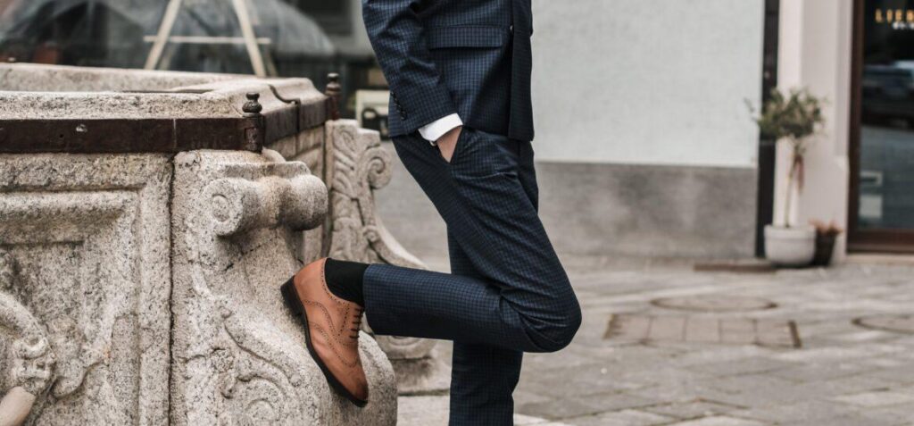
Clean, well maintained shoes in a simple silhouette elevate almost everything above them. White leather sneakers in good condition work with casual and business casual outfits alike. Leather loafers in tan or dark brown cover a wide range of smart casual situations. Simple leather boots work across seasons and contexts.
Shoe maintenance matters more than shoe price. A forty dollar pair of leather shoes that are regularly cleaned and conditioned looks better than a two hundred dollar pair worn down at the heel and scuffed across the toe. A product like Saphir shoe cream or even basic mink oil keeps leather looking cared for without significant effort or cost.
Trainer culture has expanded what’s acceptable in most contexts. But even within that space, the difference between a clean minimalist sneaker and a chunky, heavily logoed trainer creates a very different impression. Clean and simple reads upscale. Busy and branded reads casual at best, cheap at worst.
Accessories: Less Is Almost Always More
Heavy accessorizing rarely looks expensive unless done with extreme confidence and clear intention. For most people, reducing accessories to one or two meaningful pieces creates a cleaner result.
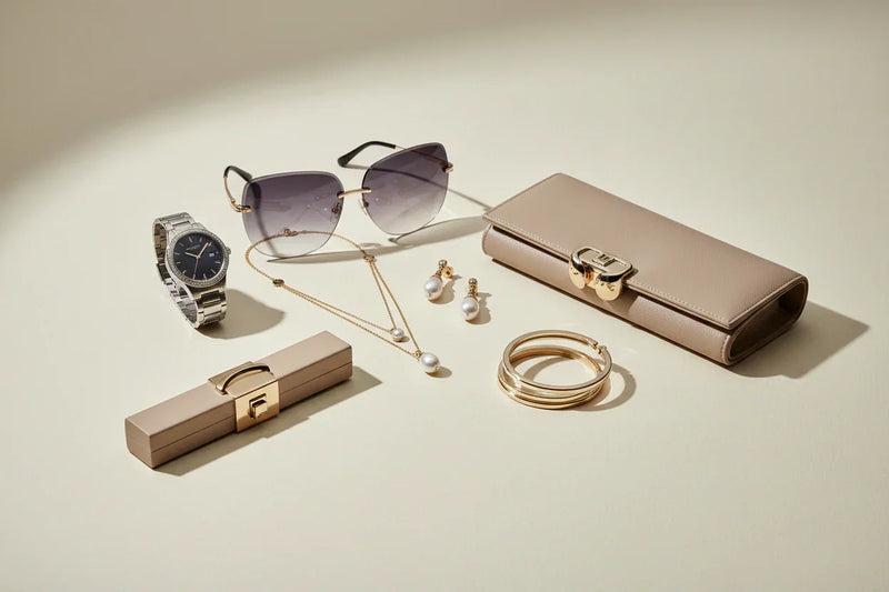
A single good watch. Stud earrings rather than large dangling ones for professional settings. One ring rather than four. A simple leather belt that matches or complements shoe color. Each of these reads quietly well without competing for visual attention.
The belt and shoe matching rule deserves a specific mention. It’s one of the older styling guidelines and not everyone follows it rigidly anymore. But keeping belt and shoe colors in the same family, brown with brown or black with black, creates a visual coherence that registers positively even without the observer consciously noticing why.
Bags fall into a similar logic. A structured bag in a neutral color reads well across almost any outfit. An overly branded bag with visible logos across every surface communicates something different than understated luxury, regardless of the price paid for it.
Grooming Completes the Picture That Clothes Start
This gets left out of most fashion articles. It shouldn’t be.

A perfectly coordinated outfit worn with unwashed hair or visibly unkempt nails reads very differently than the same outfit worn with clean, groomed presentation. The overall impression comes from the total package, not just the clothing in isolation.
Haircuts matter more than most people budget for. A well maintained haircut kept fresh every four to six weeks costs money over time. It also changes how every outfit reads immediately. Clean, shaped hair signals that detail and presentation matter to that person. It elevates everything beneath it.
Skincare doesn’t need to be elaborate. Clean, moisturized skin reads as healthy. That healthy baseline makes any outfit read better than the same outfit worn on a day when you’re visibly tired and dry.
Nail care for both men and women falls into the same category. Clean, trimmed, unbroken nails are a detail most people won’t consciously notice when done well. They absolutely notice when done badly.
Step by Step: Building an Outfit That Looks Expensive on a Budget
Here’s a practical process that pulls everything together.
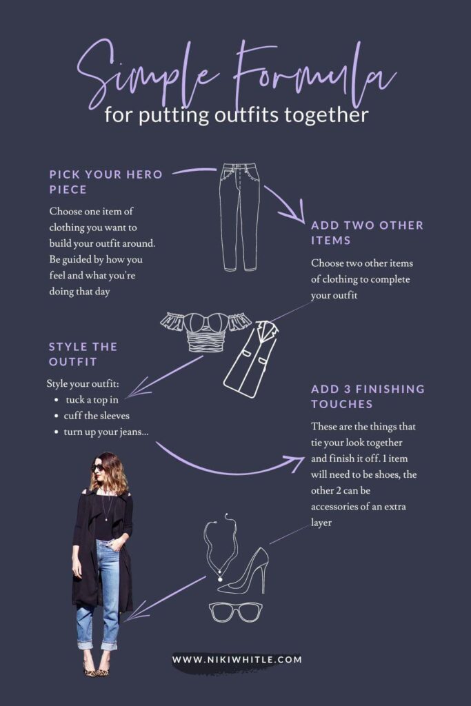
Step One: Start With Neutral Bottoms
Choose trousers, jeans, or a skirt in a neutral color. Dark navy, charcoal grey, black, or camel tan all work. Check that the waistband sits where it should and that the length is correct or can be easily hemmed.
Step Two: Choose a Top in a Compatible Neutral or Subtle Color
White, cream, light grey, and soft blue pair with almost any neutral bottom. Avoid busy prints or heavily branded pieces when aiming for a polished result.
Step Three: Check Shoulder Seams and Sleeve Length Immediately
Before committing to any top, jacket, or blazer, check that the shoulder seam sits correctly. Walk away from anything where the seam hangs off the shoulder. No alteration fixes this reliably.
Step Four: Add One Layering Piece in a Complementary Tone
A blazer, cardigan, trench coat, or structured jacket adds visual structure. Keeping it within the same color family as the rest of the outfit creates the tonal dressing effect mentioned earlier.
Step Five: Choose Simple, Clean Footwear
Clean leather sneakers, loafers, simple ankle boots, or classic pumps all work depending on context. Check for scuffs before leaving the house. Apply a quick wipe down with a damp cloth and follow with any leather conditioner if needed.
Step Six: Add One Accessory Maximum
One watch, one pair of earrings, one necklace. Not all three at once. The restraint is the point.
Step Seven: Do a Full Mirror Check for Fit Issues
Look for pulling fabric across the chest or back. Check trouser hem length. Ensure jacket sleeves show the shirt cuff correctly. This takes two minutes and catches obvious problems before they’re visible to everyone else.
Common Mistakes That Make Outfits Look Cheaper Than They Are
Wearing clothes that are too large. Baggy clothing reads as unfitted rather than relaxed. Even casual pieces should have a roughly coherent relationship with your body shape.
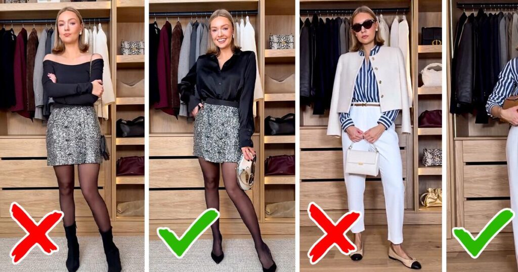
Ignoring fabric pilling. A garment with visible pilling should be removed from rotation or treated with a fabric shaver before wearing. Pilling signals age and poor fabric quality regardless of original cost.
Mixing too many patterns at once. One pattern per outfit is the safest approach. Two can work if one is very subtle. Three almost never works unless the person wearing it has exceptional styling instincts.
Wearing logos prominently. Large visible brand logos don’t signal wealth. They signal the opposite to people who understand how fashion actually works. Understated pieces without logos look inherently more elevated.
Letting shoes deteriorate without maintenance. This single mistake undermines more otherwise well assembled outfits than almost any other factor.
Buying too many cheap pieces instead of fewer better ones. Ten mediocre pieces that fit poorly cost more over time than three genuinely good pieces that fit well and last. This applies to any budget level.
Apps and Resources That Actually Help
Pinterest works well as a visual reference for building outfit combinations. Creating boards organized by color palette or occasion helps identify patterns in what you find appealing before you spend money.

The app Whering lets you catalog what you already own and build outfit combinations from your existing wardrobe. Seeing everything together often reveals either gaps or duplicates worth addressing.
YouTube channels focused on practical style advice rather than haul culture provide more useful guidance than most fashion magazines. Creators like Audrey Coyne, He Spoke Style, and Bliss Foster cover fit, fabric, and building a coherent wardrobe without relying on constant new purchases.
Depop, ThredUp, and Poshmark all offer secondhand access to quality pieces at significantly reduced prices. Many barely worn or unworn garments from better brands appear regularly on these platforms at a fraction of original retail.
Final Thoughts
Looking expensive has genuinely little to do with spending a lot of money. The visual signals that communicate quality come from fit, color discipline, fabric choice, clean accessories, and overall grooming. All of these are learnable. Most of them are free once the knowledge is there.
My friend at dinner that night had figured most of this out intuitively. Her spending wasn’t higher than anyone else at the table. Paying closer attention to the things that actually matter when getting dressed was the only real difference.
Clothes from Zara, thrift stores, and sale racks can look just as polished as anything designer. The difference between looking like you spent a lot and actually spending a lot is smaller than the fashion industry would prefer you to believe.
Pay attention to fit first. Everything else builds from there.