
I almost returned a perfectly good blazer last month because I genuinely could not figure out why it looked off against everything else in my closet. Black trousers, white shirt, classic combination that had worked for years. Something just felt dated standing in the mirror, and I could not place what.
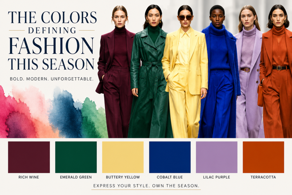
A friend who works in retail buying solved it for me in about ten seconds. My whole wardrobe was stuck in last year’s color story. Cool grays, stark blacks, the kind of palette that dominated everything for what felt like forever. Fashion had moved on, she said, toward something softer and warmer, and my closet simply had not caught up.
That conversation sent me genuinely down a rabbit hole researching what colors are actually showing up on runways and in stores right now. What I found changed how I think about building a wardrobe this season, and I want to walk through exactly what I learned.
Why Color Trends Actually Matter Beyond Just Looking Trendy
Color trends sometimes get dismissed as marketing fluff designed to push people toward unnecessary purchases. There is some truth buried in that skepticism. Fashion brands genuinely do benefit when consumers feel their existing wardrobe suddenly looks outdated.
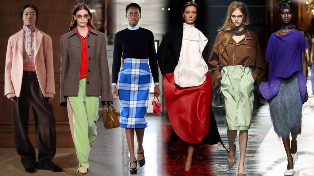
Real value still exists in understanding seasonal color shifts, though. Colors influence how an outfit reads visually, how flattering it feels against your skin tone, and how it photographs in different lighting. A single well-chosen accent piece in this season’s defining shade can refresh an entire wardrobe far more affordably than buying multiple new garments.
Pantone, the global authority on color forecasting, releases seasonal trend reports that fashion houses, retailers, and even paint companies reference constantly. Their predictions are not just aesthetic guesses. Teams analyze runway shows, consumer behavior, and cultural shifts before settling on the colors they believe will resonate with people in the months ahead.
Cloud Dancer: The Soft White Taking Over Everything
Pantone named Cloud Dancer its Color of the Year, and once you start noticing it, the shade shows up everywhere. This is not stark, clinical white. Cloud Dancer leans gently into natural putty territory, creating something softer and more wearable than the harsh whites that dominated past seasons.
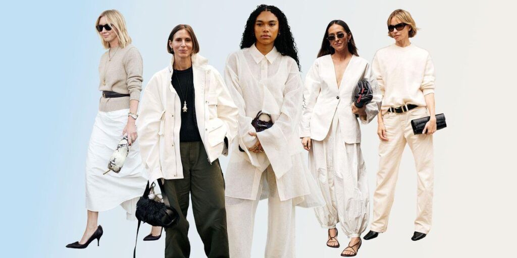
Major fashion houses including Bottega Veneta, Balenciaga, Jil Sander, and Celine all featured this hue prominently in their recent collections, working it into fluid dresses, structured suits, and accessories. The appeal lies in its versatility. Cloud Dancer functions as a calming neutral base, but it photographs as fresh and intentional rather than simply blank.
I tested this theory myself with a cream-toned coat instead of my usual black option. The difference surprised me. Black often reads as severe or heavy depending on lighting, while this softer white tone felt elegant without trying quite as hard.
How to Wear Cloud Dancer Without Looking Washed Out
Pair Cloud Dancer pieces with a contrasting accent color rather than building an entire monochromatic look, unless you genuinely love that aesthetic. A single Cloud Dancer item against deeper tones like burgundy or forest green creates visual interest without overwhelming your outfit.
Choose fabric with texture or subtle sheen when shopping for this shade specifically. Flat, matte white fabric in this tone can sometimes look unfinished, while linen blends, silk, or crepe add dimension that makes the color feel deliberate.
Save Cloud Dancer for pieces near your face if your skin tone runs cooler, since the warmth in this shade tends to flatter most complexions better than stark white does.
Marina: The Ocean Blue Bringing Calm to Everything
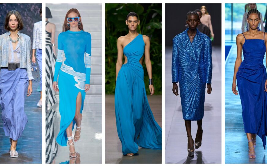
Marina has emerged as one of the defining blues of the season, described accurately as a clear ocean hue that evokes wide horizons and calm water. This is not the icy, corporate blue that has dominated professional wardrobes for years. Marina feels warmer and more approachable.
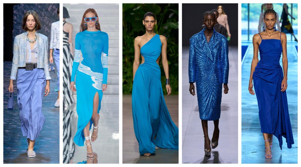
New York Fashion Week showcased this shade extensively, pairing it with both neutral tones and unexpected brights. The color works particularly well in lightweight summer fabrics, where its clarity and freshness genuinely shine.
What makes Marina interesting from a styling perspective is its flexibility across seasons. The shade pairs beautifully with Cloud Dancer for a soft, coordinated look, but it also holds its own against bolder accent colors without losing its calming quality.
Tickled Pink: Playful Without Tipping Into Childish
Tickled Pink occupies a sweet spot that pink shades often miss entirely. This rosé tone evokes blooming gardens and warm evening light rather than reading as overly sweet or juvenile, which has been the risk with brighter pinks in past seasons.
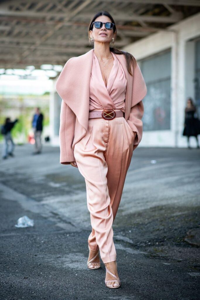
Designers have worked Tickled Pink into flowing dresses, jumpsuits, and contemporary co-ord sets, creating looks that feel spirited but still sophisticated. The shade pairs naturally with white, soft nude, or warm sand tones for an understated approach. Pairing it instead with bold red or muted orange creates a striking, fashion-forward contrast for anyone wanting more drama.
I picked up a Tickled Pink scarf as my first experiment with this trend, mostly because committing to a full garment in an unfamiliar color felt risky. That small accessory ended up transforming three different outfits I already owned, proving you genuinely do not need to overhaul your entire wardrobe to incorporate a trending shade.
Mandarin Orange and Muskmelon: Citrus Tones With Genuine Staying Power
Bright orange shades have moved from occasional accent color to genuine seasonal staple this year. Pantone specifically flagged Mandarin Orange as a real mood lifter following London Fashion Week, and the energy behind that description shows up clearly on the runway.
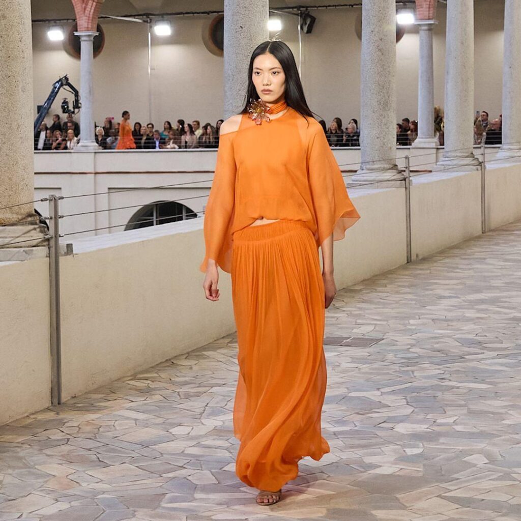
Muskmelon, a softer and slightly more fruity orange-melon tone, complements Mandarin Orange while feeling more approachable for everyday wear. These warmer citrus tones pair particularly well with the neutral bases dominating this season, creating outfits that feel energetic without veering into costume territory.
I was genuinely skeptical about orange working in my own wardrobe until I tried a Muskmelon-toned top under a neutral blazer. The combination read as polished rather than overwhelming, which surprised me given how cautious I typically am about bright colors near my face.
Step-by-Step: Easing Into Bright Accent Colors
Start with accessories rather than full garments if bright colors feel intimidating. A bag, scarf, or pair of shoes in Mandarin Orange or Muskmelon lets you test the trend without major commitment.
Pair the bright accent with one neutral base color rather than mixing it with multiple competing tones. This season’s neutrals, including Cloud Dancer, sage green, and warm caramel, all work well as a calm backdrop for these citrus shades.
Move toward a full garment in the trending color once you feel comfortable with smaller accents, choosing a piece you will genuinely wear often rather than something purely trend-driven.
Cobalt Blue: The Bold Statement Color That Refuses to Fade
Cobalt blue has shown remarkable staying power across multiple seasons now, certified as a strong choice for statement outerwear and sleek silhouettes. Bottega Veneta worked this shade into striking coats, while Loewe used it for sleek dresses and Givenchy brought it into playful pants.
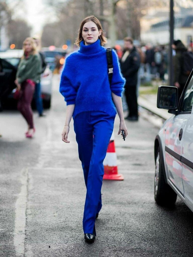
This is a confident, saturated blue that demands attention rather than blending into the background. Unlike the softer Marina shade, Cobalt Blue works as a genuine statement piece rather than a calming neutral.
The color genuinely photographs beautifully, which explains part of its sustained popularity across social media and street style coverage. Outfits built around a single Cobalt Blue piece, kept simple everywhere else, tend to look the most polished and intentional.
Deep Eggplant: The Sophisticated Alternative to Black
Fall and winter collections have made a compelling case for deep eggplant as a muted, moody alternative to standard black. Designers including Diotima, Proenza Schouler, and Cult Gaia have all featured this rich purple-brown tone in evening wear and structured pieces.
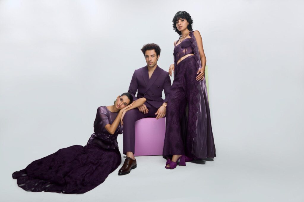
What makes eggplant interesting is its versatility for people who love wearing black but want something that feels slightly fresher. The shade carries similar depth and sophistication while reading as more considered and seasonal rather than defaulting to the safest possible neutral.
I swapped a black evening dress for an eggplant-toned alternative recently, and the compliments I received specifically mentioned the color rather than just the silhouette, which rarely happens with basic black pieces.
Sage Green and Olive: Earthy Neutrals With Lasting Power
Green tones across the sage and olive spectrum have moved firmly into neutral territory rather than functioning as occasional accent colors. These muted, natural greens with gray undertones work as a sophisticated alternative to traditional beige or gray bases.
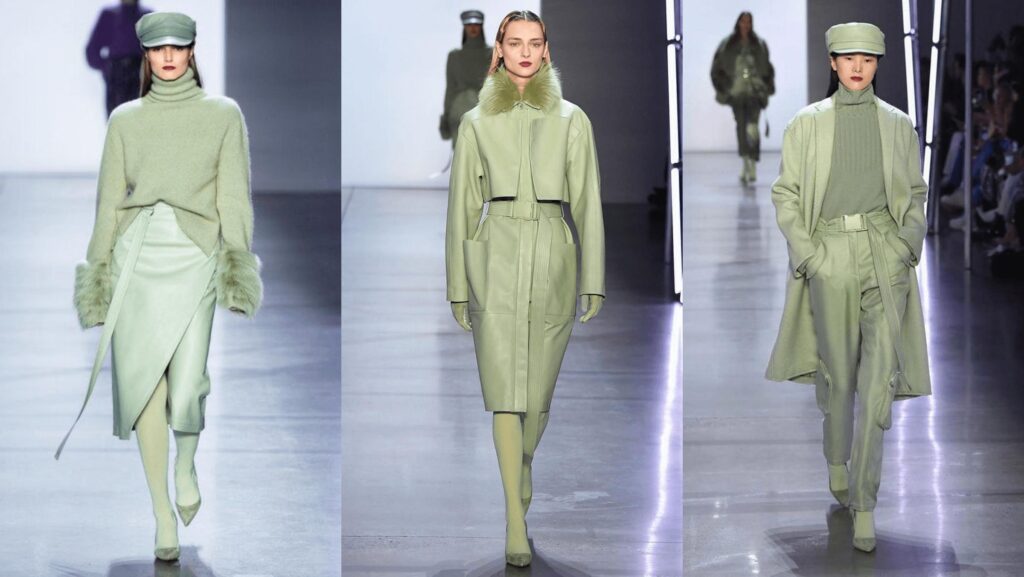
Celebrities including Gigi and Bella Hadid have been spotted favoring olive green specifically, with the shade increasingly treated as a wardrobe staple rather than a seasonal trend that will quickly fade. Sage green has similarly dominated certain categories like bridesmaid dressing for several consecutive seasons now, suggesting genuine staying power beyond typical trend cycles.
These earthy greens pair naturally with the warm neutrals and citrus brights defining this season, creating a cohesive palette that feels grounded and intentional rather than scattered across unrelated color families.
Mustard Yellow: Defying Seasonal Boundaries
Mustard yellow has proven itself as a genuinely season-defying color rather than the typical autumn-only shade most people assume it to be. Designers have shown this tone successfully across both warm and cool weather collections, pairing it with everything from purple skirts to turquoise outerwear.
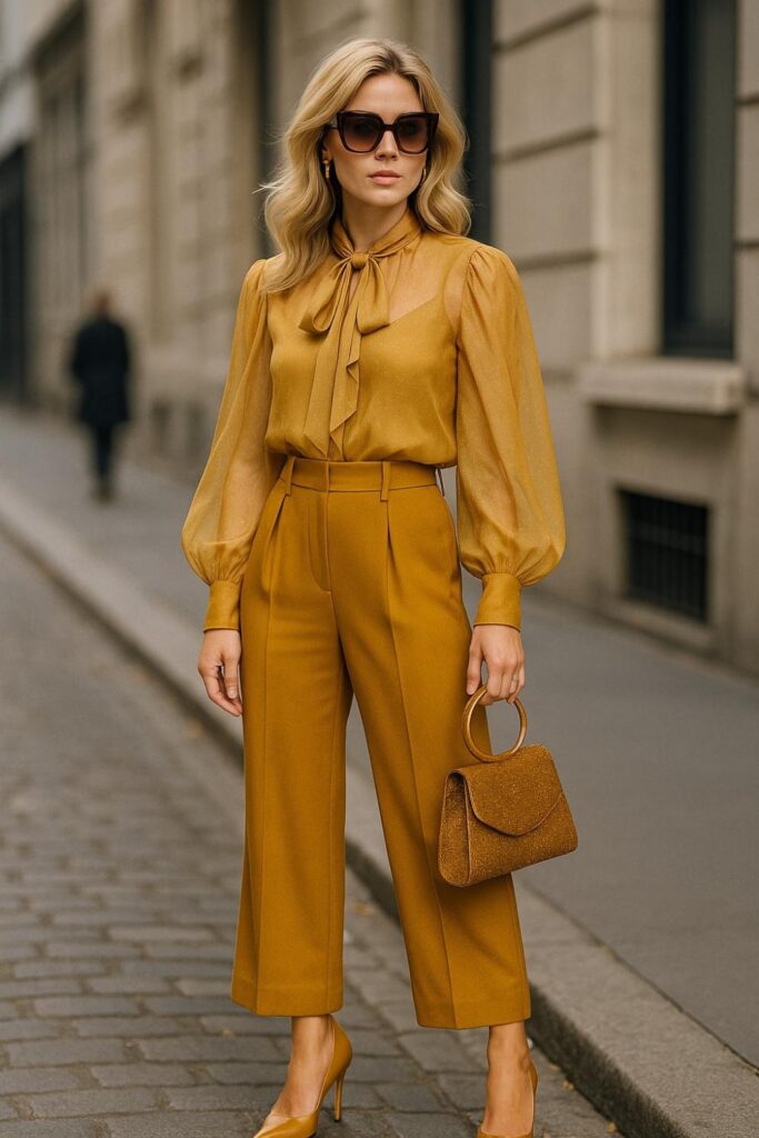
Sergio Hudson notably styled mustard as a head-to-toe statement, while Valentino paired a mustard chiffon top with purple and pink for a genuinely unexpected combination that worked beautifully on the runway.
This versatility makes mustard a smart investment piece for anyone hesitant about committing to trend-driven colors. A single mustard sweater or jacket extends wear across multiple seasons rather than feeling locked into one specific time of year.
How to Actually Shop This Season’s Colors Without Overspending
Building an entirely new wardrobe around seasonal trends gets expensive fast, and most stylists genuinely advise against that approach anyway. A smarter strategy focuses on strategic additions rather than wholesale replacement.
Identify two or three colors from this season’s palette that genuinely appeal to you personally, rather than trying to incorporate every trending shade simultaneously. Trends work best when filtered through what actually suits your existing style and coloring.
Shop secondhand platforms like ThredUp, Poshmark, or Depop first when hunting for trending colors, since seasonal shifts mean previous-season pieces in similar tones often appear at significant discounts.
Invest in one higher-quality piece in your chosen trend color rather than several cheaper versions, particularly for colors you anticipate wearing frequently across multiple seasons like sage green or mustard yellow.
Test trending colors through accessories before committing to full garments, since a scarf, bag, or pair of shoes lets you experiment with minimal financial risk while still genuinely updating your overall look.
Common Mistakes People Make With Seasonal Color Trends
A few patterns show up repeatedly when people try to incorporate trending colors, and recognizing them helps avoid wasted money and closet regret.
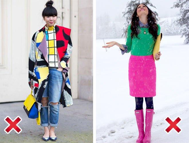
Buying every trending color simultaneously creates a disjointed wardrobe rather than a cohesive one. Outfits built from competing trend pieces often clash rather than complement each other, since not every trending shade was designed to pair naturally with every other trending shade.
Ignoring personal skin tone and existing wardrobe color story leads to pieces that look beautiful on the hanger but wrong once actually worn. Holding a potential purchase near your face in natural lighting before buying remains one of the simplest ways to avoid this mistake.
Assuming trend colors require completely abandoning your existing wardrobe wastes money unnecessarily. Most trending shades this season, particularly the earthy neutrals like sage green and the warm whites like Cloud Dancer, integrate easily alongside classic pieces you likely already own.
Chasing every micro-trend rather than focusing on colors with genuine staying power leads to a closet full of items worn only briefly before falling out of favor. Colors like olive green and mustard yellow have proven themselves across multiple seasons now, making them safer investments than shades tied to one specific moment.
Building a Cohesive Capsule Around This Season’s Palette
Combining several of these trending colors into one cohesive capsule wardrobe works better than scattering random pieces across unrelated tones. A practical approach starts with Cloud Dancer or a similar soft neutral as your base, then layers in one or two accent colors that genuinely suit you.
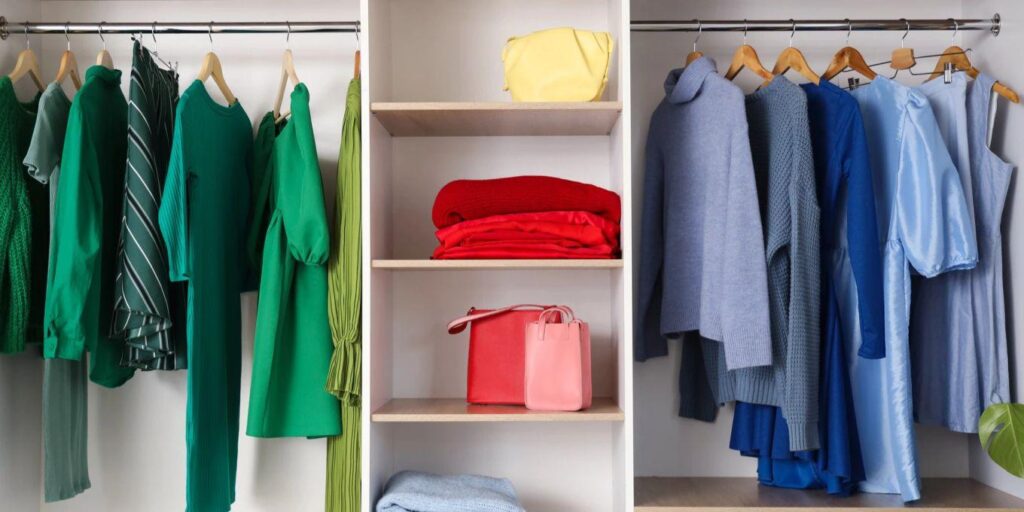
Someone drawn to warmer tones might build around Mandarin Orange and Mustard Yellow, anchored by warm caramel and sage green neutrals. Someone preferring cooler tones might lean into Marina and Cobalt Blue, balanced against Cloud Dancer and deep eggplant for evening pieces.
This approach creates outfits that feel current without requiring you to track every single trending shade simultaneously. Two or three colors, chosen deliberately and worn consistently, read as a defined personal style rather than a confused attempt to follow every trend at once.
Final Thoughts
That blazer I almost returned eventually found new life paired with a Marina-toned scarf, proving my friend right about how much a single color update can shift an entire outfit’s energy. The lesson stuck with me well beyond that one piece.
Seasonal color trends do not require a complete wardrobe overhaul to actually matter. Pick one or two shades from this season’s palette that genuinely speak to you, test them through accessories first, and build outward from there. Fashion moves quickly, but a thoughtfully chosen color update tends to outlast the trend cycle that introduced it, becoming simply part of how you dress rather than a passing moment you eventually grow out of.